D.I.Y Filters
The material for the filters was coloured plastic. I used Red, Purple, yellow and clear. My favourite filter to use was the clear one, because it gave the image quite a soft focus. I put the plastic over the end of the camera lens and secured it with an elastic band.
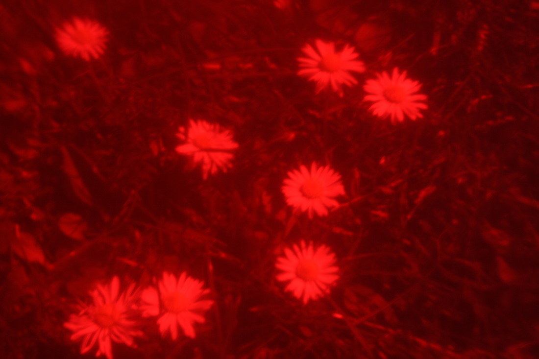
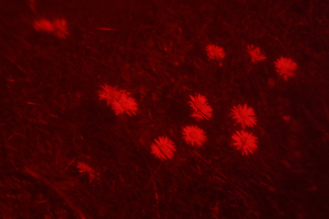
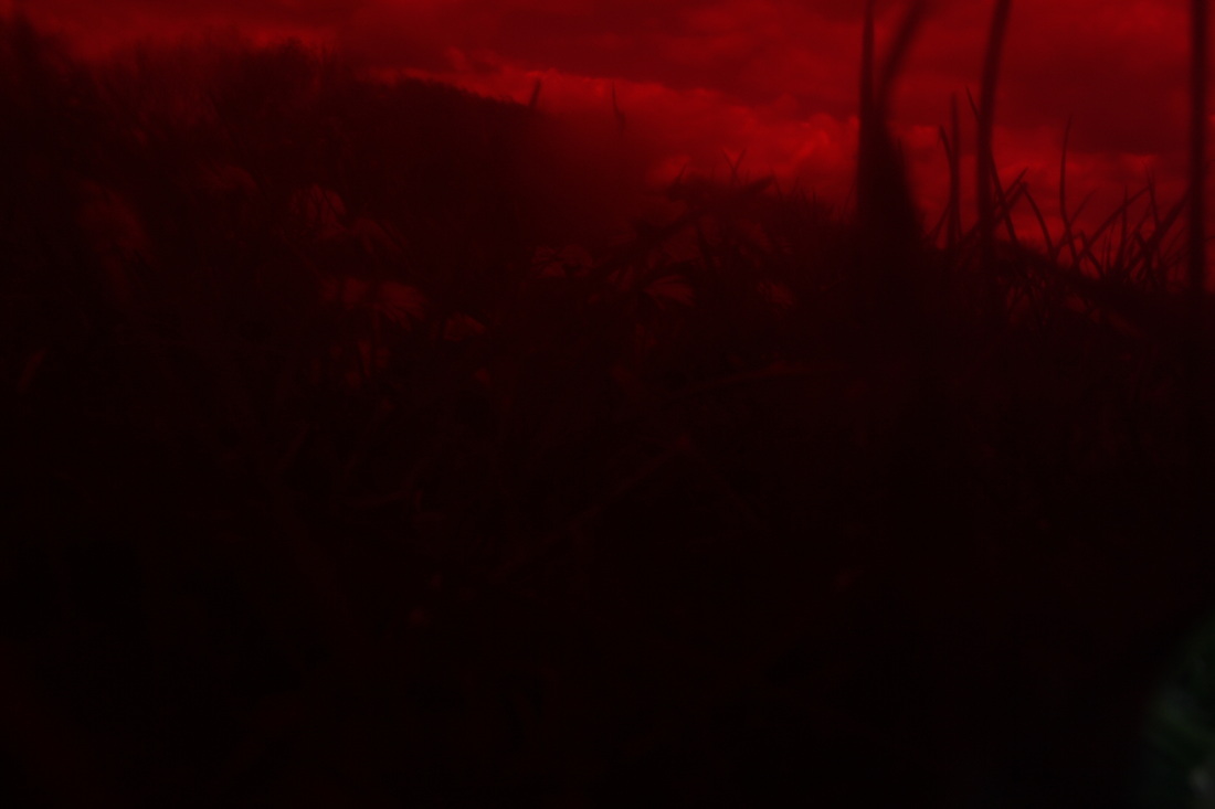
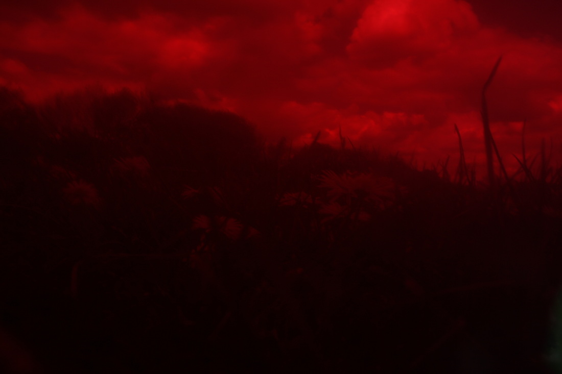
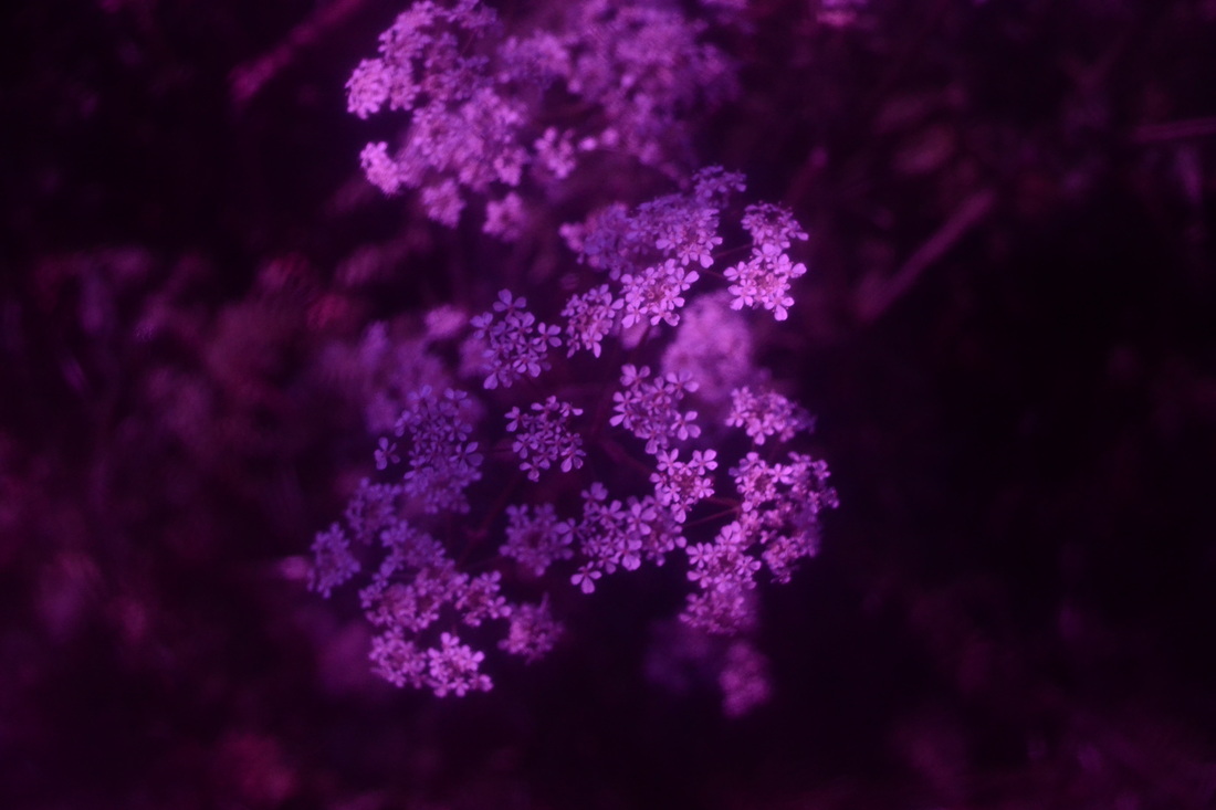
These photos turned out a bit dark because of the red filter. I like the first photo of the daisies because its not too dark. I think the last 2 photos are too dark but this also makes them look slightly mysterious and makes you wonder what is happening in it.
I loved using these filters because they had really nice effects on the images.
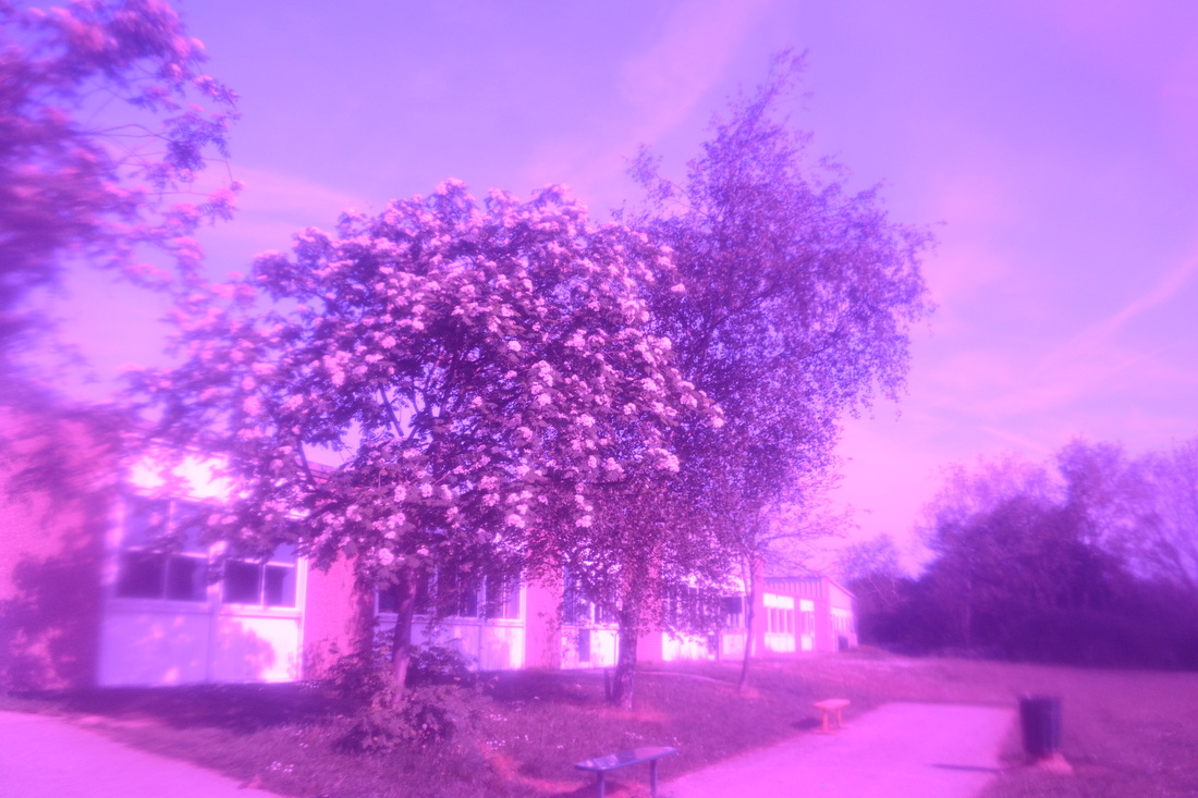
I like the first photo because it looks slightly vintage. I used the purple filter which also make sit look slightly blurry around the edges of the photo.
On the second photo, I used a clear filter. This gives the photo a softer focus which is a nice effect.
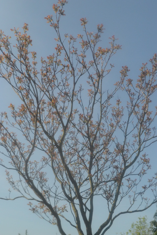
On the third photo I used a purple filter but it was taken in a shaded area so it isn't as bright as the first one of the tree.
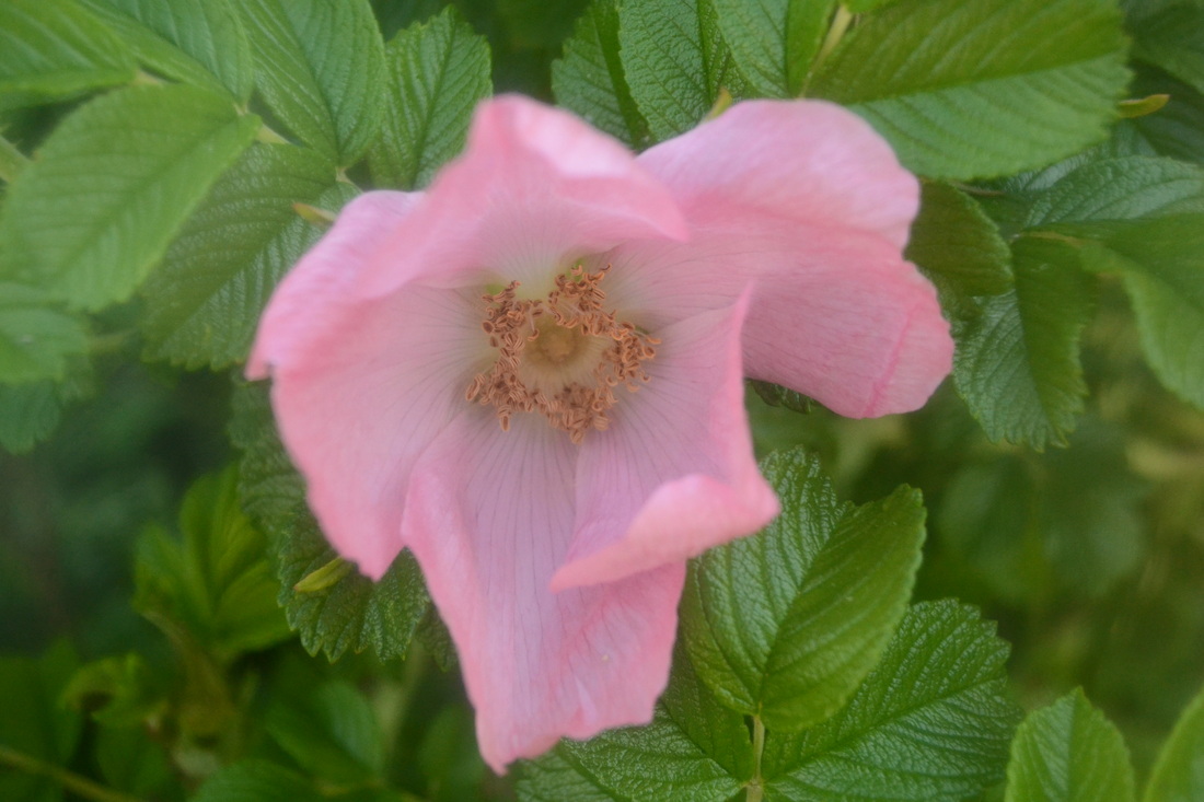
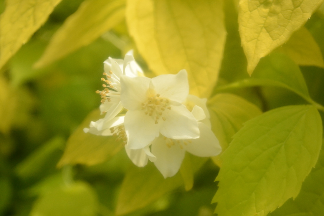
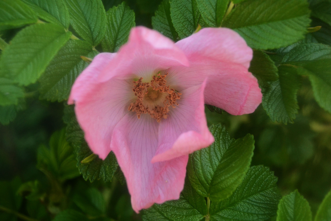
I really like the fourth photo because it has focused of the centre of the flower but the edges of the leaves are softer focus because of the clear filter.
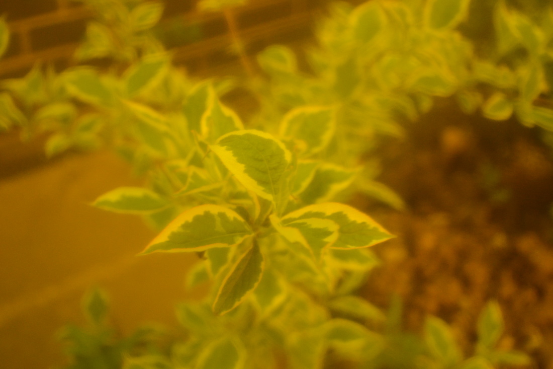
On the fifth photo, I used a yellow-y/orange-y filter. This makes the white parts of the plants look slightly more Yellow, but also makes it a bt harder to see the part of the plant that is in focus. this is why this isn't may favourite photo.
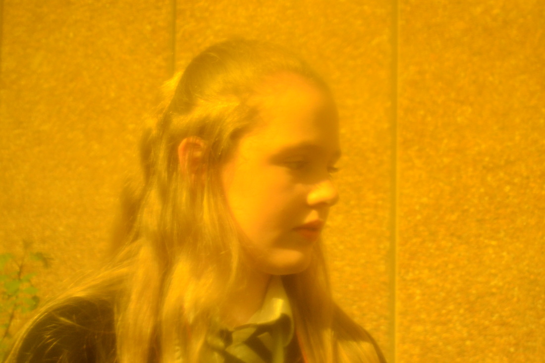
I took a picture of Holly for the sixth photo. I also used the yellow-y/orange-y filter. This gives it an almost vintage look.
I like the first photo because it looks slightly vintage. I used the purple filter which also make sit look slightly blurry around the edges of the photo.
On the second photo, I used a clear filter. This gives the photo a softer focus which is a nice effect.
On the third photo I used a purple filter but it was taken in a shaded area so it isn't as bright as the first one of the tree.
I really like the fourth photo because it has focused of the centre of the flower but the edges of the leaves are softer focus because of the clear filter.
On the fifth photo, I used a yellow-y/orange-y filter. This makes the white parts of the plants look slightly more Yellow, but also makes it a bt harder to see the part of the plant that is in focus. this is why this isn't may favourite photo.
I took a picture of Holly for the sixth photo. I also used the yellow-y/orange-y filter. This gives it an almost vintage look.
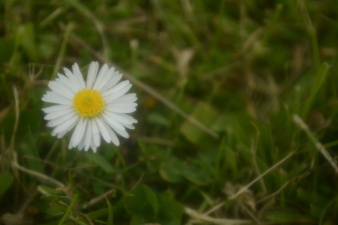
I like the picture of the daisy because I used the rule of thirds and the daisy is nice and bright, and In focus. I also like the contrast because the daisy is very bright however the grass is a dark green and not in focus, which make us look at the daisy first. I used a clear filter which gives the edge of the petal of the daisy a softer focus.
The second photo is quuite bright which means the flower doesn't stand out as much as it could have.
The second photo is quuite bright which means the flower doesn't stand out as much as it could have.
I increased the contrast and darkened the photo on Photoshop. I like this photo because the tops of the petals are out of focus, and this is caused by the clear filter.
