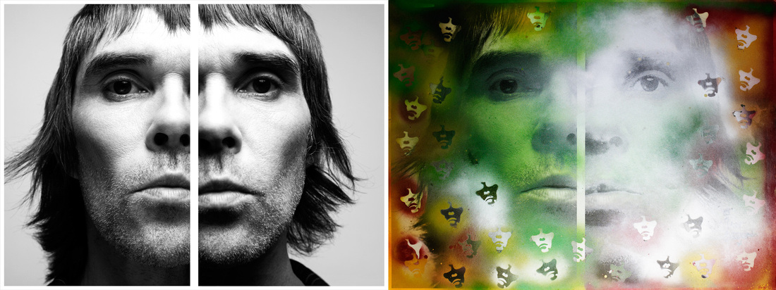
Destroy
Rankin
|

|
|
|
|
I like the destroy photo of Ian Brown because I like the way that it looks like other pictures of him have been spray painted on around him.
I also like the colours used. Green, White, Orange and Brown. |
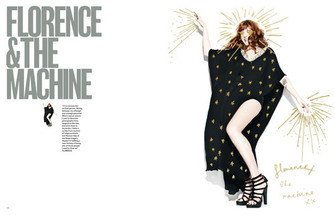
I like the destroy photo of Florence & The Machine, because I like the use of the colour Gold around her. Its really simple, but cool.
|
|
|
|
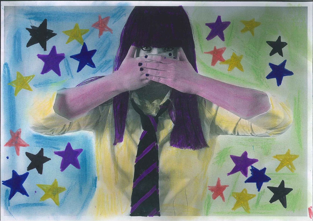
I like the stars around the edge and the different colours used.
I don't like the purple hair, yellow shirt and pink arms! |
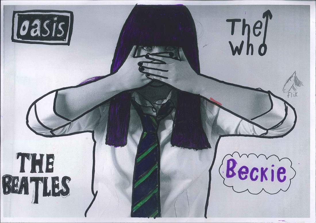
I'm not sure about the band logos/horse around the edge! for the outline, the pen I used was too thick.
|
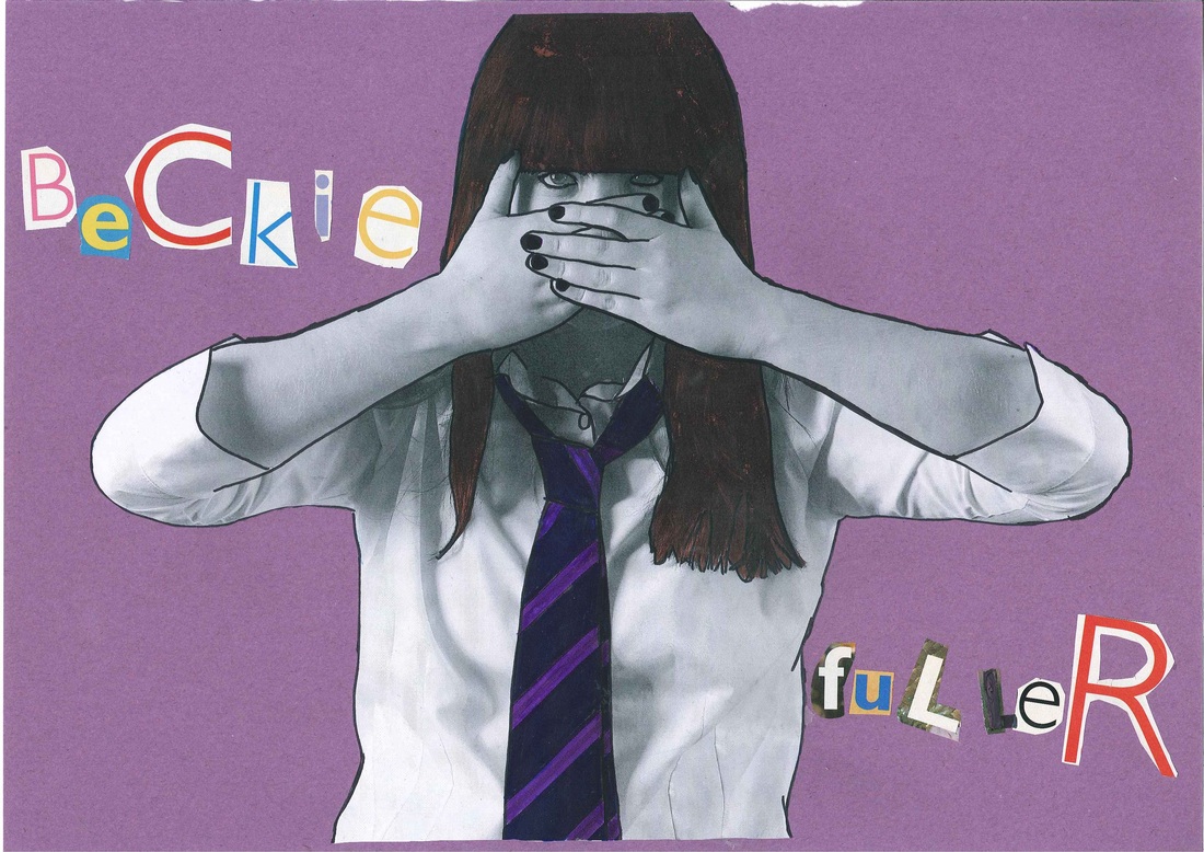
WWW: my name written out using the cut out letters. My hair also looks better coloured in brown than purple!
EBI: I could have been more careful when outlining. It would have looked better if I didn't out line my eyes.
EBI: I could have been more careful when outlining. It would have looked better if I didn't out line my eyes.
